Teacher Workload – How does it stack up?

After my post last week on wellbeing, a number of people said the root of the problem is workload.
I started teaching in 1994. Maybe it’s just nostalgia getting the better of me, but I remember working evenings and weekends. “It’s always been the same”, I thought to myself. “Teachers have always worked long hours.” So I set out to test my thoughts.
Turns out it HASN’T always been the same. Teachers HAVE always worked long hours, but the average number of hours worked per week has increased significantly over my career.
Here are the stats for classroom teachers in Primary and Secondary Schools. Hours for SLT are even longer.
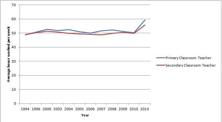
1994: Primary classroom teachers worked an average of 48.8 hours a week.
2013: Primary classroom teachers worked an average of 59.3 hours a week.
1994: Secondary classroom teachers worked an average of 48.6 hours a week.
2013: Secondary classroom teachers worked an average of 55.7 hours a week.
These are all taken from the Workload Diary Surveys by the School Teachers’ Review Board (2006 – 2008), and the DCSF/DFE (2009-2013).
You can see from the rather basic graph above, the lines show an overall upward trend, with a rather dramatic upswing between 2010 and 2013.
The 2013 figures are a little skewed by the addition of classroom teachers in Academies as a separate group, who worked an average of 55.2 hours a week.
There was also a significant change in the method of sampling in 2013, from recruiting teachers through schools to a random sample from the workforce census. The report concludes that this has led to “a greater degree of self-selection in 2013 than in previous years. Whereas previously the survey included responses from a broader range of teachers in a sample of schools, this year’s survey relied more heavily on those teachers who had a greater motivation to respond.” Teachers’ workload diary survey 2013 Research report February 2014 DFE
I think what they are trying to say there is that teachers with a large workload were more likely to respond and therefore the figures are higher.
No comparable government data seem to have been published since. (If you know of any, do tell!)
So, I’m not really in a position to draw any conclusions on this yet. I began digging down into the analysis in the 2013 report (https://www.gov.uk/government/uploads/system/uploads/attachment_data/file/285941/DFE-RR316.pdf if you are interested) but it struck me that the massive changes in the system in the last two years with the new curriculum and removal of levels probably mean that this data is already way out of date.
So if anybody has any more up to date data I can use, I would be most grateful!
Sam
Sam is a primary school teacher and founder of schoolwell.co.uk. You can find her on twitter or staffrm or send her an email.
